STYLE
GUIDE
Kiss my Orange is a natural orange drink for Singaporeans aged 35 to 70. It fits real routines, from the morning step out the door to the afternoon pause, with real fruit, clear labels and a fresh lift.
Sound like a capable friend who keeps good habits and shares them kindly. Warm, clear and brief, with a light wink from the name. Never loud, preachy or “old”.
A FRESH LIFT, EVERY DAY
The Logo
The Kissed Slice turns the name into a picture: a real orange cross-section with a soft kiss inside, beside “kiss my ORANGE”. It is the primary logo and leads on every touchpoint.
Logo Evolution
From “fun and sunshine” to “the daily orange”: how the first AI-generated logo became the final Kissed Slice, and why each change serves the brief.
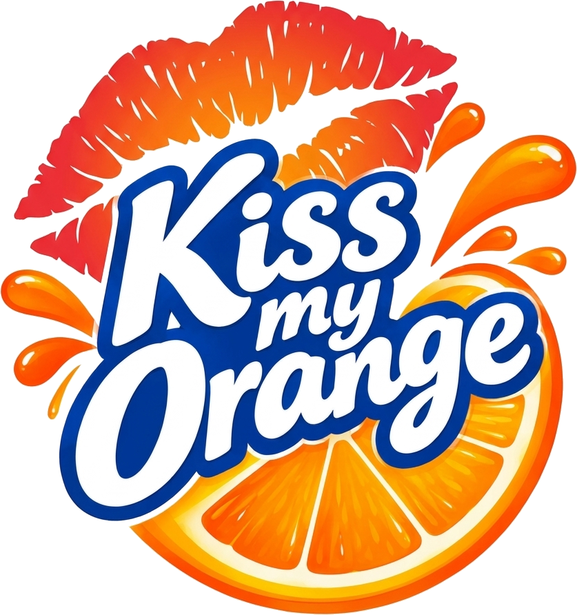
Loud, glossy, impulsive
Sunshine-and-splash cliché
Red & blue, off-brand
→ Warm, calm, confident
→ Real fruit, honest
→ Orchard Morning palette
Logo Don’ts
The personality lives in the layouts and photography around the logo, not in changes to the logo itself. Always use the master artwork.

Colour · Orchard Morning
Two dominant colours carry the brand: cream for calm, green for trust. Three accents add the fruit, the warmth and the earth.
Typography
Three free Google Fonts, three jobs: one leads, one talks, one winks.
DAILY
ORANGE
NOPQRSTUVWXYZ 0123456789
Medium 500 · sub-heads
Regular 400 · body copy
A fresh lift, every day.
pause.
Do keep body copy left-aligned and short.
Don’t set paragraphs in Marcellus or Cormorant.
Don’t add a fourth typeface.
Imagery
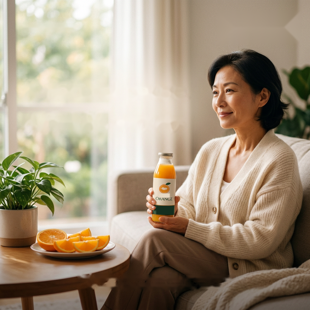
Real, warm and calm: real people and real fruit in soft natural daylight, with room for type.
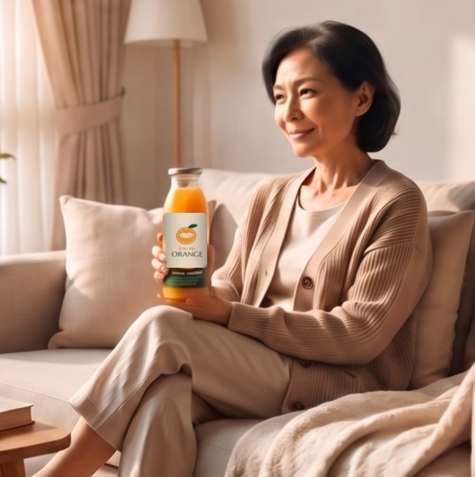



Cast real Singaporeans aged 35–70, not posed stock smiles.
Keep backgrounds plain and warm so the fruit and people stand out.
Real oranges cut fresh on the day.
The bottle always shows the current label, facing camera.
Oranges stay juicy, greens stay fresh, never neon.
Use licensed or original photos only.
Spacing & Layout
One hero per layout, an 8 px rhythm and generous margins keep the brand calm and easy to read.
start early.
Logo Placement
The Kissed Slice leads on every touchpoint, placed in a corner or dead centre. The slice icon steps in at small sizes.
Pattern & Packaging
The slice icon and the kiss, set at gentle angles on an even half-drop grid. Use on gift boxes, sleeves, tote bags and social backgrounds.
Logo on pattern: always on a solid cream or green panel, never straight on the repeat.
Scale: each icon at least 12 mm wide in print.
Mix: one pattern colourway per item; pair a patterned surface with a solid one.