KISS MY ORANGE
KISS MY ORANGE · BRAND STYLE GUIDEVERSION 1.0 · OCTOBER 2026
kiss my
ORANGE
A FRESH LIFT, EVERY DAY
BRAND
STYLE
GUIDE
the daily orange.
How Kiss my Orange looks, sounds and shows up: logo, colour, type, spacing, imagery, placement, pattern and packaging.
SINGAPORE
KISS MY ORANGE · BRAND STYLE GUIDE02 / 11
BRAND ESSENCE
The daily orange for people who look after themselves.

Kiss my Orange is a natural orange drink for Singaporeans aged 35 to 70. It fits real routines, from the morning step out the door to the afternoon pause, with real fruit, clear labels and a fresh lift.

MISSION
To be Singapore’s daily orange for people who look after themselves: real fruit, honest labels and a fresh lift for every routine.
AUDIENCE
Active, routine-minded Singapore adults aged 35–70 who check labels, watch sugar and want a trusted daily habit, not a party drink.
PERSONALITY
Quietly confidentHonestCalmWarmFreshReliableCapableLightly wittyRespectfulNatural
TONE OF VOICE

Sound like a capable friend who keeps good habits and shares them kindly. Warm, clear and brief, with a light wink from the name. Never loud, preachy or “old”.

REAL ORANGES · HONEST LABELS
A FRESH LIFT, EVERY DAY
pause, peel back, carry on.
WE SAY
a fresh lift · a natural source of Vitamin C* · your daily orange · clearly labelled
WE AVOID
boosts immunity · cures · party, crazy, epic · “for seniors” · sweet treats
KISS MY ORANGE · BRAND STYLE GUIDE04 / 11

Logo Evolution

From “fun and sunshine” to “the daily orange”: how the first AI-generated logo became the final Kissed Slice, and why each change serves the brief.
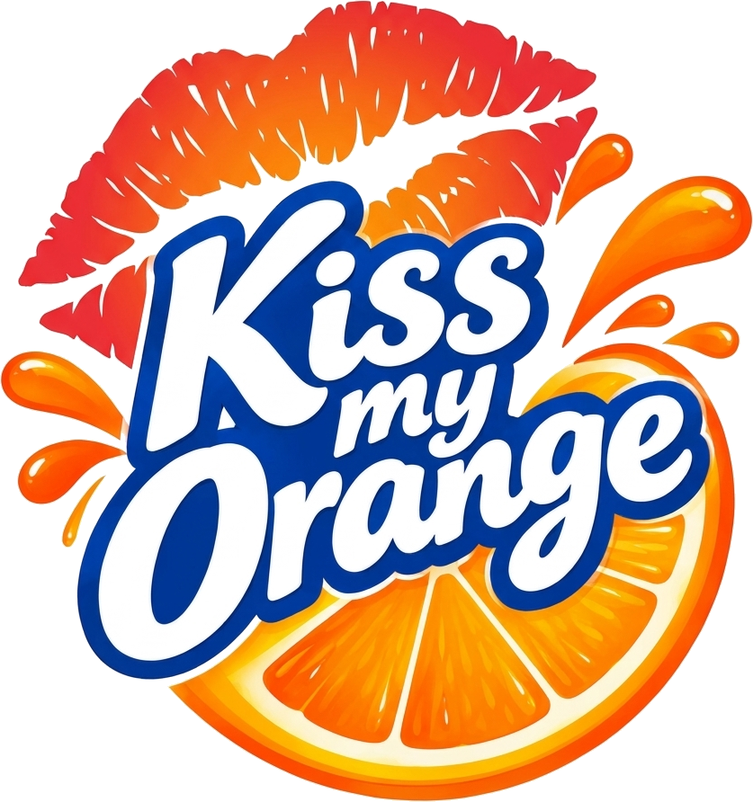
Version 1ORIGINAL AI LOGO
Mood-board fit
4 / 10
→5 CONCEPTS TESTED
Final · “Kissed Slice”CONCEPT 5
kiss my
ORANGE
A FRESH LIFT, EVERY DAY
Primary
Reversed
One-colour
Icon alone
Mood-board fit
9.5 / 10
Strategic intent: the daily orange for people who look after themselves.
VERSION 1 SAID
Party drink for teens
Loud, glossy, impulsive
Sunshine-and-splash cliché
Red & blue, off-brand
FINAL SAYS
→ Trusted daily habit
→ Warm, calm, confident
→ Real fruit, honest
→ Orchard Morning palette
ELEMENTVERSION 1FINALWHY IT CHANGED (LINK TO STRATEGY)
1
Symbol
Big red lipstick print floating over a glossy orange wedge
One flat orange cross-section with a soft cream lip shape inside
The kiss stays as a light wink, not a romantic gimmick. Real fruit leads, supporting honest and natural.
2
Colour
Lipstick red, royal-blue outline, saturated gloss gradients
Deep Orange #D9640E, Golden Orange #F29A2E, Leaf Green #1F4A33 on Morning Cream
Red and blue were off-palette. Orchard Morning colours feel warm and trusted, not sugary, and stand apart from Sunkist.
3
Typeface
Bubbly cartoon letters, white fill, heavy blue outline
“kiss my” in Cormorant italic over “ORANGE” in Marcellus
Bubble type reads teen and loud. Marcellus gives calm authority for 35–70s; the logo carries the wit, the type stays quietly confident.
4
Effects
Juice splashes, droplets, gloss highlights, shading
Flat shapes only; no shadows, glows or splashes
“Sunshine and splash” is the category cliché. Flat art prints cleanly on caps and labels down to 12 mm / 48 px.
5
Tagline
None in the lockup
“A FRESH LIFT, EVERY DAY” in spaced Figtree caps
States the daily ritual and an SFA-safe benefit in five words, replacing mood words like “burst of joy”.
6
System
One busy lockup that only works large and on white
Primary, reversed, one-colour and icon-alone versions with clear space and minimum sizes
Consistency and restraint (lessons from Sunkist and Louis Vuitton) build recognition; the icon works on caps, apps and avatars.
KISS MY ORANGE · BRAND STYLE GUIDE05 / 11

Logo Don’ts

The personality lives in the layouts and photography around the logo, not in changes to the logo itself. Always use the master artwork.
✕
kiss my
ORANGE
A FRESH LIFT, EVERY DAY
Don’t stretch or squash it
✕
kiss my
ORANGE
A FRESH LIFT, EVERY DAY
Don’t recolour it outside the palette
✕
kiss my
ORANGE
A FRESH LIFT, EVERY DAY
Don’t rotate it
✕
kiss my
ORANGE
A FRESH LIFT, EVERY DAY
Don’t add shadows, glows or outlines
✕
kiss my
ORANGE
A FRESH LIFT, EVERY DAY
Don’t place it on busy photos
✕
Kiss My Orange!
typed out, no slice
Don’t retype or redraw it
KISS MY ORANGE · BRAND STYLE GUIDE06 / 11

Colour · Orchard Morning

Two dominant colours carry the brand: cream for calm, green for trust. Three accents add the fruit, the warmth and the earth.

DOMINANT
Morning Cream
HEX #F4EADB · RGB 244 234 219 · CMYK 0 4 10 4
Backgrounds, labels, packaging. The calm space people should remember.
DOMINANT
Leaf Green
HEX #1F4A33 · RGB 31 74 51 · CMYK 58 0 31 71
Logo wordmark, headlines, claims, caps and the shop sign.
ACCENT
Juice Orange
HEX #EE8A2A · RGB 238 138 42 · CMYK 0 42 82 7
The fruit itself, product shots, highlights.
ACCENT
Deep Orange
HEX #D9640E · RGB 217 100 14 · CMYK 0 54 94 15
The slice rind, “kiss my”, taglines.
ACCENT
Sand
HEX #C9A27C · RGB 201 162 124 · CMYK 0 19 38 21
Warm support, textures, secondary panels.
PROPORTION IN USE
60%
30%
Cream leads, green grounds, accents stay small. CMYK values are approximate; confirm with your printer on a proof.
READABLE PAIRINGS
Aa ✓ Aa ✓ Aa ✓ Aa ✕
Use green or ink text on cream; cream on green. Avoid small white text on orange.
KISS MY ORANGE · BRAND STYLE GUIDE07 / 11

Typography

Three free Google Fonts, three jobs: one leads, one talks, one winks.

DISPLAYMARCELLUS
THE
DAILY
ORANGE
ABCDEFGHIJKLM
NOPQRSTUVWXYZ 0123456789
Headlines, logo, pack front. Mostly capitals, line height 1.05.
TEXTFIGTREE
Aa Bb
SemiBold 600 · labels & buttons
Medium 500 · sub-heads
Regular 400 · body copy
Real oranges, honest labels and every number right there on the bottle.
Body copy, nutrition panels, captions, website. Min 16 px on screen, 9 pt on pack.
ACCENTCORMORANT ITALIC
Aa Bb
kiss my
A fresh lift, every day.
The brand’s wink: “kiss my”, taglines and short pull quotes. One line at a time.
HIERARCHY
Headline
72 / 40 · Marcellus
Sub-head
24 · Figtree 500
Body copy
18 · Figtree 400
Tagline
32 · Cormorant 600i
3:30 PM · THE AFTERNOON PAUSE
A natural
pause.
A fresh lift, every day.
Do let one headline lead each layout.
Do keep body copy left-aligned and short.
Don’t set paragraphs in Marcellus or Cormorant.
Don’t add a fourth typeface.
KISS MY ORANGE · BRAND STYLE GUIDE09 / 11

Imagery

Real, warm and calm: real people and real fruit in soft natural daylight, with room for type.
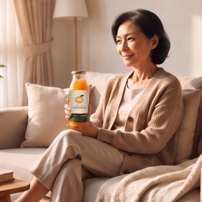
✓
Real routines, real age
Candid adults aged 35–70 in morning and afternoon moments, bottle held naturally.
✓
Real fruit, up close
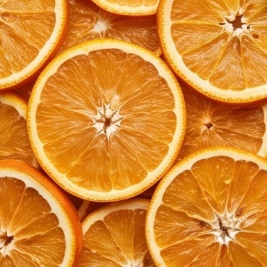
Fresh slices, peel and leaves. Juicy colour, no fake gloss or splashes.
✓
Calm natural textures
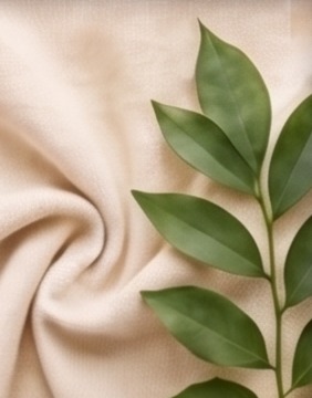
Cream linen, knit, oak and a fresh leaf give space for headlines.
✕
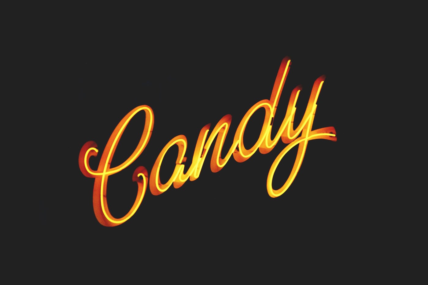
Not dark, cold or party
No nightlife, neon, blue grading or heavy vignettes.
PHOTOGRAPHY
Shoot at eye level in soft window light.
Cast real Singaporeans aged 35–70, not posed stock smiles.
Keep backgrounds plain and warm so the fruit and people stand out.
STYLING
Cream, sand and green props: linen, oak, ceramics, plants.
Real oranges cut fresh on the day.
The bottle always shows the current label, facing camera.
COLOUR GRADING
Warm white balance (+5), gentle contrast, natural skin tones.
Oranges stay juicy, greens stay fresh, never neon.
Use licensed or original photos only.
KISS MY ORANGE · BRAND STYLE GUIDE08 / 11

Spacing & Layout

One hero per layout, an 8 px rhythm and generous margins keep the brand calm and easy to read.

LOGO CLEAR SPACE
kiss my
ORANGE
A FRESH LIFT, EVERY DAY
xx xx
x = the height of the leaf on the slice. Keep this gap clear on every side.
8 PX SPACING SCALE
8 · icon to label
16 · lines in a group
24 · between cards
32 · inside panels
48 · between sections
64 · social post margin
96 · poster / web hero margin
Every gap is a multiple of 8 px, so layouts feel consistent across print and screen.
SOCIAL POST GRID · 1080 × 1080
7:00 AM · STEP OUT FRESH
Good habits
start early.
kiss my
ORANGE
A FRESH LIFT, EVERY DAY
64 px margins and a 6-column grid. Headline top-left, logo bottom-right, hero image in the middle.
Outer margins: at least 6% of the shorter edge, e.g. 64 px on a 1080 px post, 12 mm on A4.
One hero: a headline, a photo or the logo leads; leave about 40% of the space empty.
Corners: square or a gentle 8–12 px radius on cards and photos, echoing the calm, classic type.
KISS MY ORANGE · BRAND STYLE GUIDE10 / 11

Logo Placement

The Kissed Slice leads on every touchpoint, placed in a corner or dead centre. The slice icon steps in at small sizes.
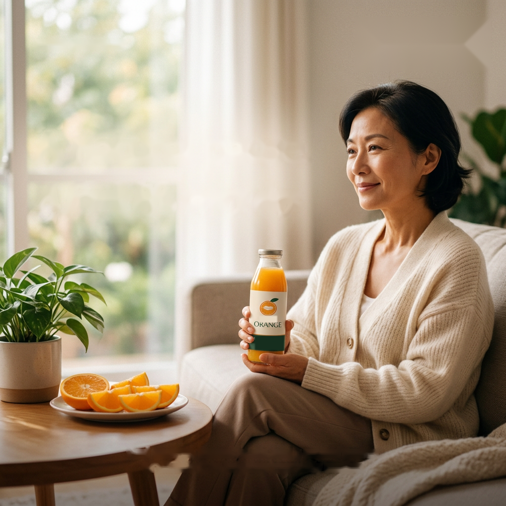
A natural
pause.
kiss my
ORANGE
A FRESH LIFT, EVERY DAY
Social post
Bottom-right on the margin, 20–28% of the post width. Headline top-left.
kiss my
ORANGE
PRESSED ORANGE · 330ML
Bottle label
Icon and wordmark centred on the cream label; facts on the green band.
kiss my
ORANGE
A FRESH LIFT, EVERY DAY
Paper bag
Centred in the upper third, tagline underneath, one-colour green on kraft.
kiss my
ORANGE
A FRESH LIFT, EVERY DAY
Chiller / kiosk
Logo on a cream header panel above the fridge, framed in Leaf Green.
Where: top-left, bottom-right or dead centre. Never floating mid-edge.
On what: cream, white, Leaf Green, kraft, or a calm plain area of a photo.
Small spaces: bottle caps, app icons, stamps and favicons use the slice icon alone.
KISS MY ORANGE · BRAND STYLE GUIDE11 / 11

Pattern & Packaging

The slice icon and the kiss, set at gentle angles on an even half-drop grid. Use on gift boxes, sleeves, tote bags and social backgrounds.

A · Morning (hero)#F4EADB · #D9640E · #1F4A33
B · Orchard#1F4A33 · #F2B266
C · Sand#C9A27C · #F4EADB
kiss my
ORANGE
4-pack carton · B
Bottle sleeve · A
KISS MY ORANGE
Gift box lid · C
PACKAGING RULES
Use on sleeves, cartons, boxes, totes and social backgrounds.
Logo on pattern: always on a solid cream or green panel, never straight on the repeat.
Scale: each icon at least 12 mm wide in print.
Mix: one pattern colourway per item; pair a patterned surface with a solid one.